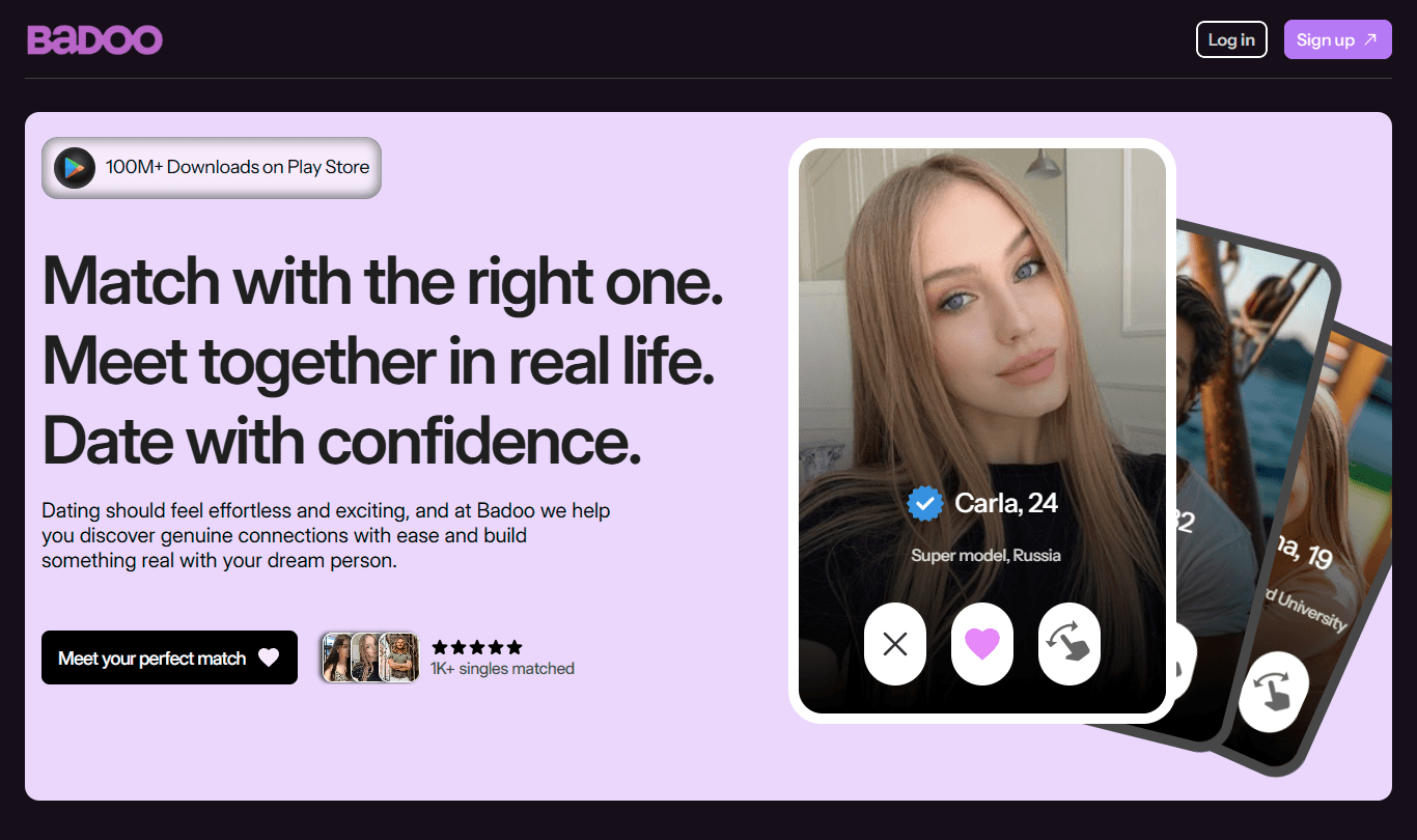
I added a sticky nav-bar to ensure you will not need to scroll back up to join of the platform is viable.
The visuals have been spiced up to show what the users will experience inside the platform.
The new headline now communicates the purpose of the app, and is more benefit-driven.
The new subheading uses simple English, and complement the headline.
I used one CTA leading to a sign up form, aside it I added a review badge to build up more trust.
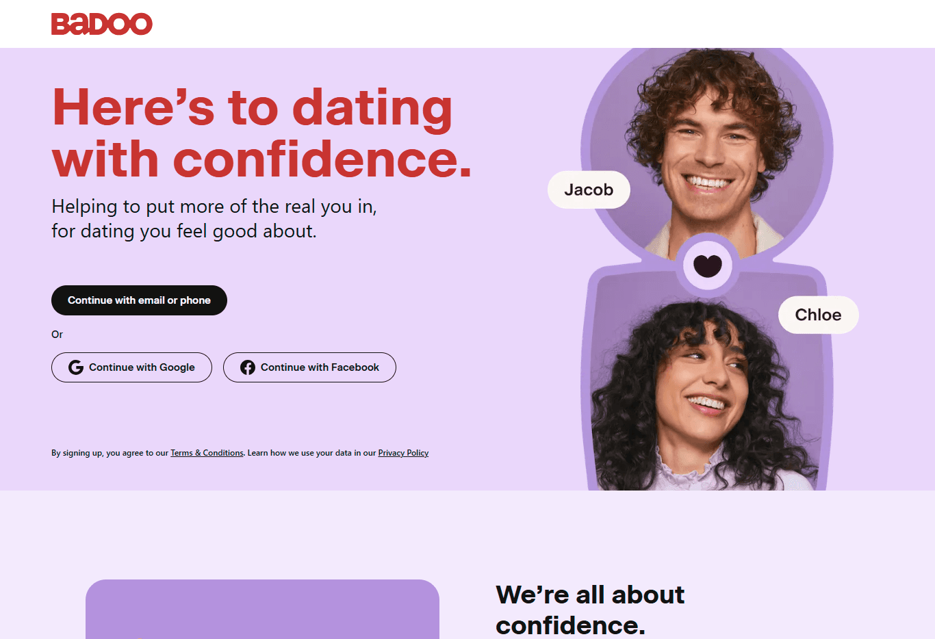
The headline communicates purpose behind the app, not the benefits of using the app.
The subheading is good, but the English used, isn't easy for the unaware audience to understand.
In my opinion the visual is really good! But it if was a demo video, conversion rates would skyrocket.
The CTA's would have benefited from being well organized, & 2 CTA's would reduce decision making time.